Build a dashboard from a SharePoint list without Power BI
The team maintains a Projects list with columns for Status, Budget, Region, and an end date. Someone asks for a dashboard on the site home so that users can stop manually opening the list and row-counting. The immediate response is to use Power BI. However, the tenant does not have any Power BI Pro licenses or the report requires sharing through Power BI Premium, or it requires embedding on a modern page and transforms a half-hour request into a two-day endeavor.
For something as simple as showing data from the list, all this is unnecessary. I created a SharePoint Framework web part that reads a list or library and renders the dashboard directly on the page. Nothing fancy like Power BI, charting, or exporting data. The list is the data source, and the page is the report.
This solution is called List Dashboard. Drag it on to a page, connect to a list, and select the view of the data that you desire:
- A single stat number (count, sum, average, min, max)
- KPI tiles broken down by a column
- Bar, column, pie, or donut
- Line or area over a date column, bucketed by day, week, or month
- A sortable table
You place it a few times on one page, each instance set to a different view, and that is your dashboard. Here is one built entirely from a single list:
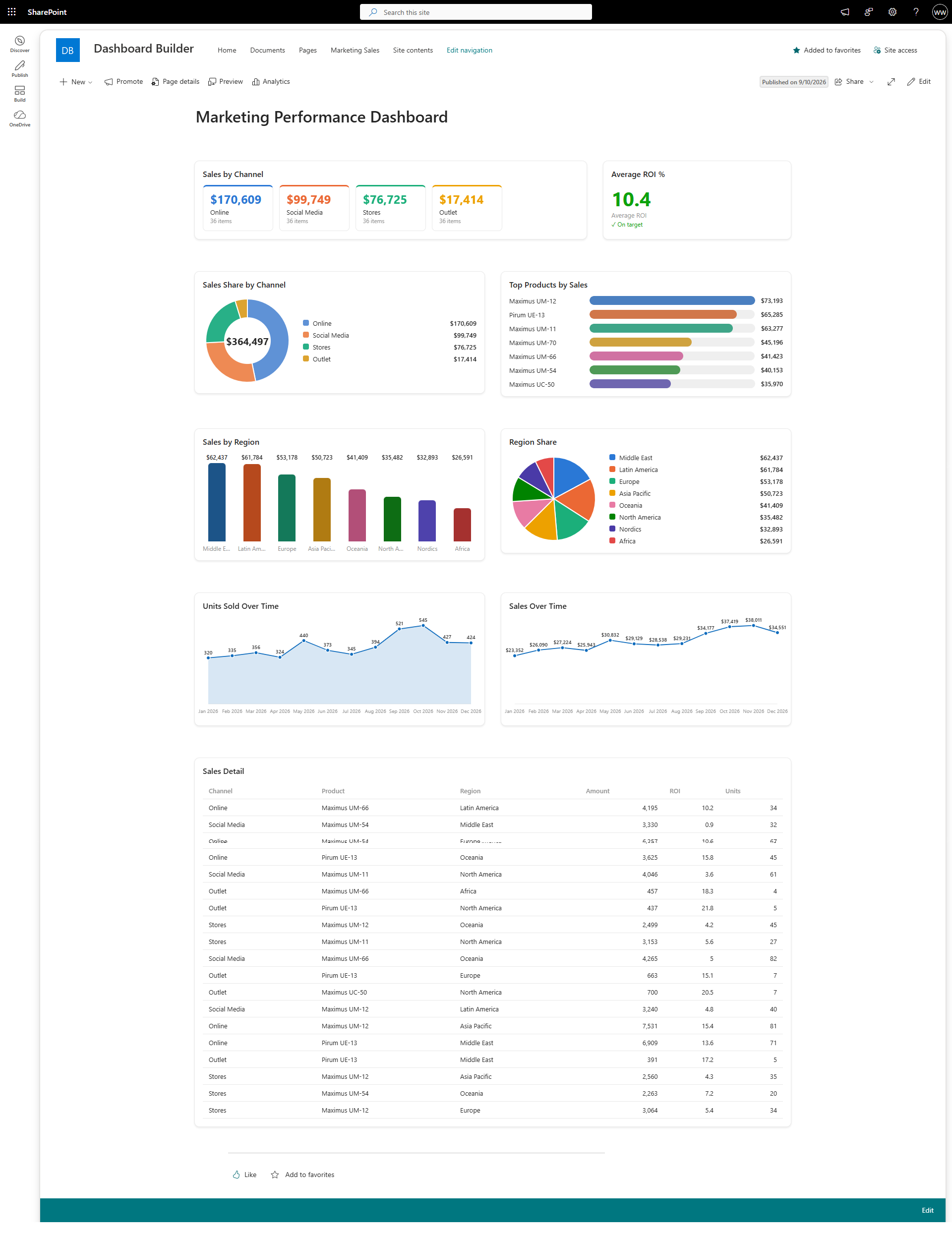
Setting one up takes about a minute:
- Add the List Dashboard web part to a page.
- In the property pane, pick your list or library.
- Choose a display type.
- Map the columns: Group by (say Status), Value field (say Budget), and an Aggregation (sum).
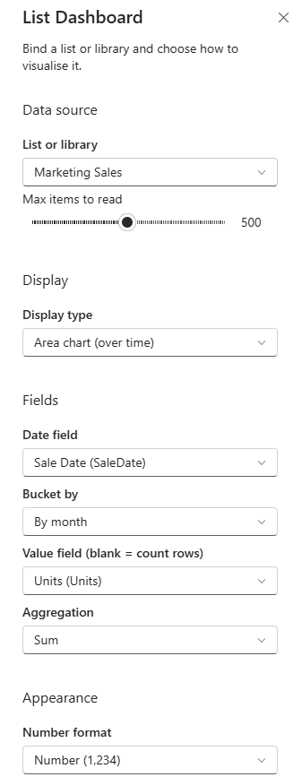
That produces you the budget by status in terms of tiles. Change the visualization to Bar Chart and the same mapping produces you a bar chart. In case of trend visualization choose a date field and bucket it by month.
There are few aspects worth knowing once you go beyond the demo version. The colors used are not generated randomly but are colorblind-safe. This means that each category will always be displayed using the same color no matter how many charts on the page. The value of data points formats as currency or percentage of the whole. Also, there is a status visualization which paints the tile green, amber, or red according to the pre-set target, while displaying the tick or cross icon near the value in order to preserve the state readability for people who are unable to distinguish colors.
It can work with any list. It analyzes your columns and supports person and lookup columns and ignores the missing one, rather than producing an error. There is sample data provided, so once you drag the control to the page it renders right away.
The code and the package are on GitHub in my SPFx web part suite: github.com/gvijaikumar9/SPFx-Intranet-Suite. Download the .sppkg from the latest release, upload it to your app catalog, deploy, and the web part turns up in the toolbox under Data visualization.